SEARCH


|
|
|
|


Ask yourself: Are you missing photo opportunities because you’re not paying close enough attention to your surroundings? Stop where you are; take a look around. Abstract images
I made this image while I was attending an exhibition at the Pavilion of Knowledge in Park of Nations, located on the left bank of River Tagus in Lisbon, Portugal. Innovative architects built most of the park for the World’s Fair that took place in Lisbon in 1998. The park is full of contemporary architecture, leisure and cultural hotspots, premium residential living, and it is considered to be one of the largest urban redevelopment projects in Europe.
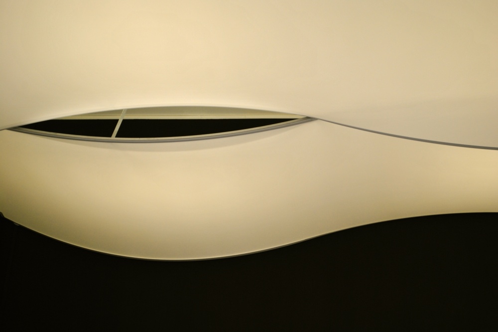
Nikon D3000 . Nikkor 18-55mm f/3.5-5.6 . f/5.3
The Pavilion of Knowledge, first called The Knowledge of the Seas Pavilion in reference to the Expo 98 oceans theme, was designed by architect João Luís Carrilho da Graça and engineer António Adão da Fonseca. After the World’s Fair, it was renamed and became an interactive science and technology museum. Its mission is to make science available to people of all ages, and to encourage experimentation and exploration of the physical world.
" Despite the simplicity of ceiling’s design, the visual effect was quite appealing; what’s more, its appearance changed dramatically as I moved around the room."
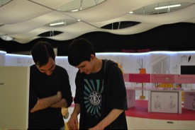
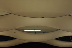
My kids and I went to an interactive exhibition that showed us how science is interwoven with everyday life, and it used common household appliances as examples. While I was photographing the kids being entertained by the scientific experiments, I nonchalantly glanced up at the false ceiling of the large room. I noticed its metal frame, integral lighting and wide bands of white cloth that created the illusion of waves. The walls and ceiling were painted black, which enhanced the contrasting white panels of the ceiling installation. Despite the simplicity of ceiling’s design, the visual effect was quite appealing; what’s more, its appearance changed dramatically as I moved around the room.
At that moment, I recalled Dadaist/Surrealist Man Ray, as he was one of the first photographers who tried to break away from the literal representation of reality. I was inspired to try something different. The ceiling was aesthetically pleasing and it had something quite original about it — I could not just take a picture of it. A photograph of this ceiling would hold very little interest, but an abstract image would be strong and distinct.
"A strong composition compels the viewer to focus on the points of interest, thus reaching the heart and soul of the image."
I began thinking in abstract terminology, and imagined the best way to take advantage of form, color and texture. I was satisfied that this approach would provide a more balanced picture, and by using the rule of thirds, create a carefully constructed composition as well. The aesthetic quality of an image is most important to me: the order of the elements in the foreground in relation to the secondary elements must be correct; and the texture, shapes and balance of color must all combine to create an image that connects with the viewer on some level. Additionally, a strong composition compels the viewer to focus on the points of interest, thus reaching the heart and soul of the image.
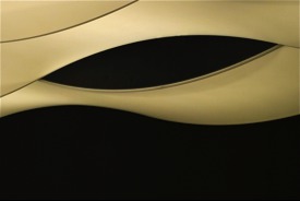
As I wandered about the room looking for new perspectives and angles, I discovered that the more minimalistic images were the most successful. After taking 15 or so pictures, I was excited to see that I had captured exactly what I had intended: a huge, penetrating eye watching my every move.
POST PROCESSING
This picture was shot in JPEG format. I used iPhoto to do the post-processing.
1) In iPhoto I first increased Contrast to +27 and Saturation to +15.
2) I slightly cropped the image.
3) I tried to remove the small, semi-vertical metal bar on the structure, but iPhoto’s retouching tool is not very accurate. In the end, I am happy that I did not get rid of the metal bar since it would have misrepresented the structure’s actual appearance.
TIPS
1) Always take several shots from one certain angle using different focal lengths. Once your safe shot is taken, shoot several more images from different angles using different focal lengths. You may be surprised later to find that your first shot is not your favorite one.
2) Always shoot in Manual mode: you have the most control over the outcome, and you can use the play of light and shadows to your advantage.
3) Search the internet for pictures and information about the location you want to shoot.
4) Originality and creativity are essential to produce a successful image.
5) Once you arrive at your location, take a few minutes to look around and to get a good feel for the place. Allow the space to talk to you.
6) It is the sensitivity of the photographer that makes a good picture, not just good photographic equipment.
BIOGRAPHY
I was born in 1959 in Porto, Portugal, and I now live in Setúbal, Portugal. I was strongly influenced by my father, and my interest in my culture started when I was very young. I have devoted myself to teaching, but I discovered my passion for photography after my children were born. I prefer architectural minimalism, the contrast of colors and the graphic effects that are created by light. I look for geometry, texture and structures in perfect harmony.
 | Write |
 | Yvette Depaepe CREW Beautiful abstract shot and so well edited, Maria José! Thanks for this fine tutorial and congratulations with the publication. Stay safe and healthy, my friend! |
 | Maria José Ramos Thank you so much |