SEARCH


|
|
|
|


by Editor Lourens Durand
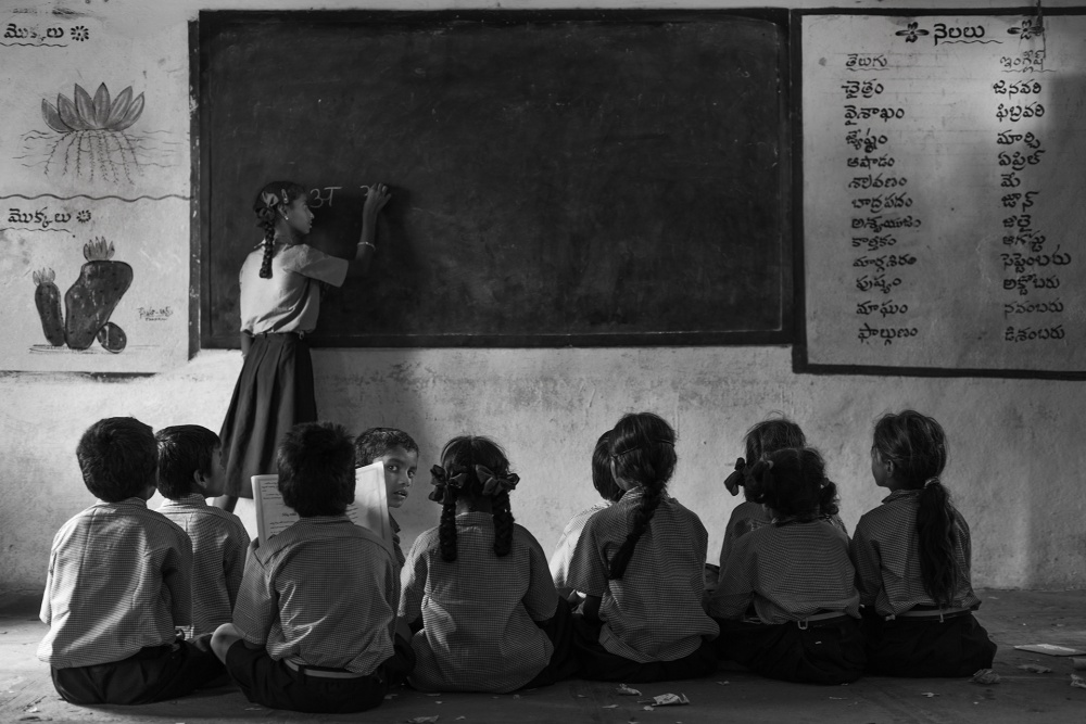 'store of class' by Haitham AL Farsi
The Gestalt School of Thought arose just over 100 years ago as some psychologists started looking at the human mind and behaviour holistically, rather than as a combination of parts. They proposed that we do not automatically focus on small details and components, but rather on the whole picture. Their proposition was that the whole is greater than the sum of its parts.
This school of thought was part of the foundation of modern perception theory but was short-lived in psychological circles and nowadays only merits a mention in introductory courses on perception.
The effect on composition in art and photography, however, has been much more long-standing. In German, Gestalt means form, or the way in which things are put together, so it is not surprising that some of the Gestalt principles have changed the way artists look at composition. When we look at a picture, we see the whole but subconsciously, the parts, the small details and how they are put together, influence what we see as the whole. Interestingly, our individual life experiences may have a lot to do with how the small things influence the bigger picture, and so different people may see different things in the big picture.
Let’s have a look at some of these principles and how they relate to photography, bearing in mind that there may be more than one principle used in any one photograph.
Principle of Similarity
The human eye finds that objects sharing visual characteristics such as shape, size, colour and texture, belong together. Patterns appear to create harmony, and a break in a pattern introduces a sense of dissonance.
Principle of Focal Points
Areas in a composition with points of interest, emphasis or difference will hold the viewers’ attention better than if they were absent.
Principle of Parallelism
Elements that are parallel to each other appear to be more related to each other than other elements that are not.
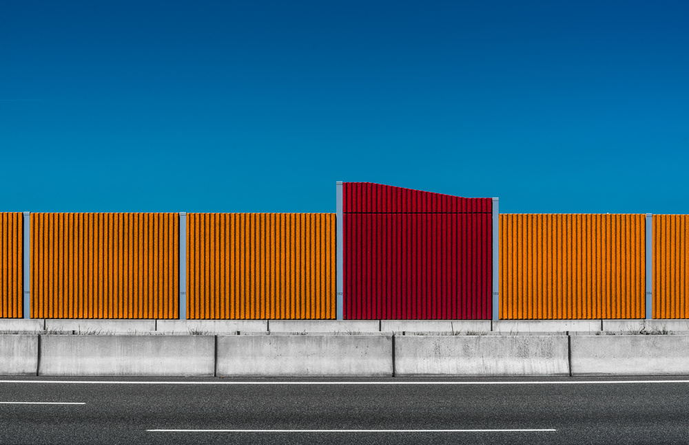
'100 – 101 – 102 – 103 – 104' by stefan krebs
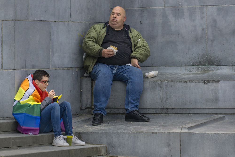
'The look' by Jef Van den Houte
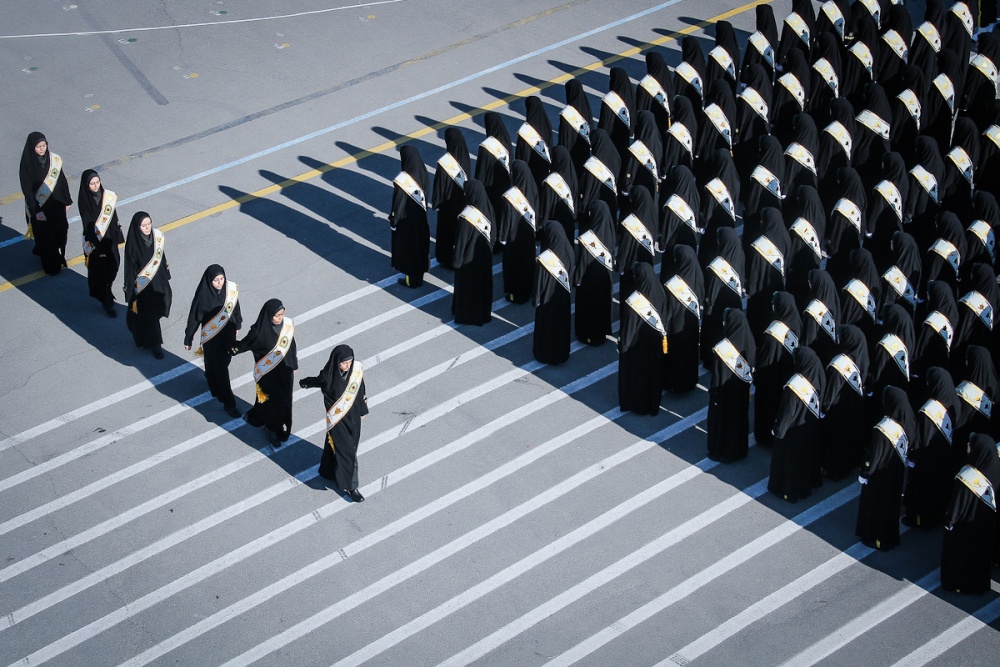
'Army of Women' by Foad Ashtari
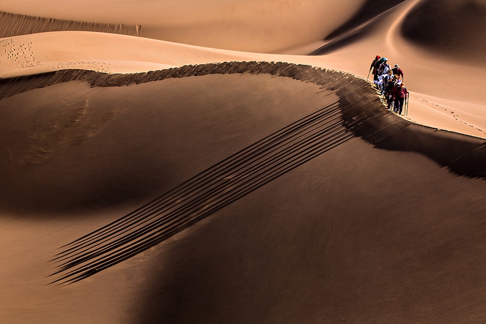
'Parallel' by Mohammadreza Momeni
Principle of Continuation
Our eyes follow things that have the least amount of interruption along paths, lines and curves, perceiving elements arranged along the way as being related to each other, Another aspect is that, when there are lines going in a particular direction, it is assumed that they continue in this direction even out of the frame.
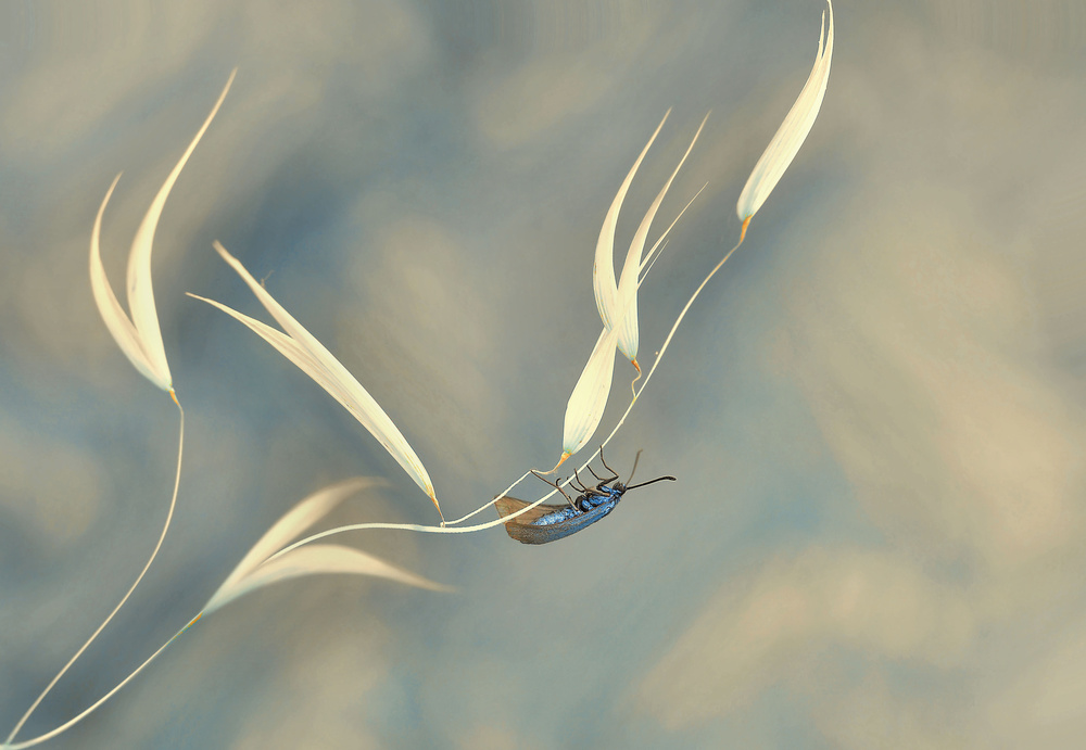
'Symphony unfinished...' by Thierry Dufour
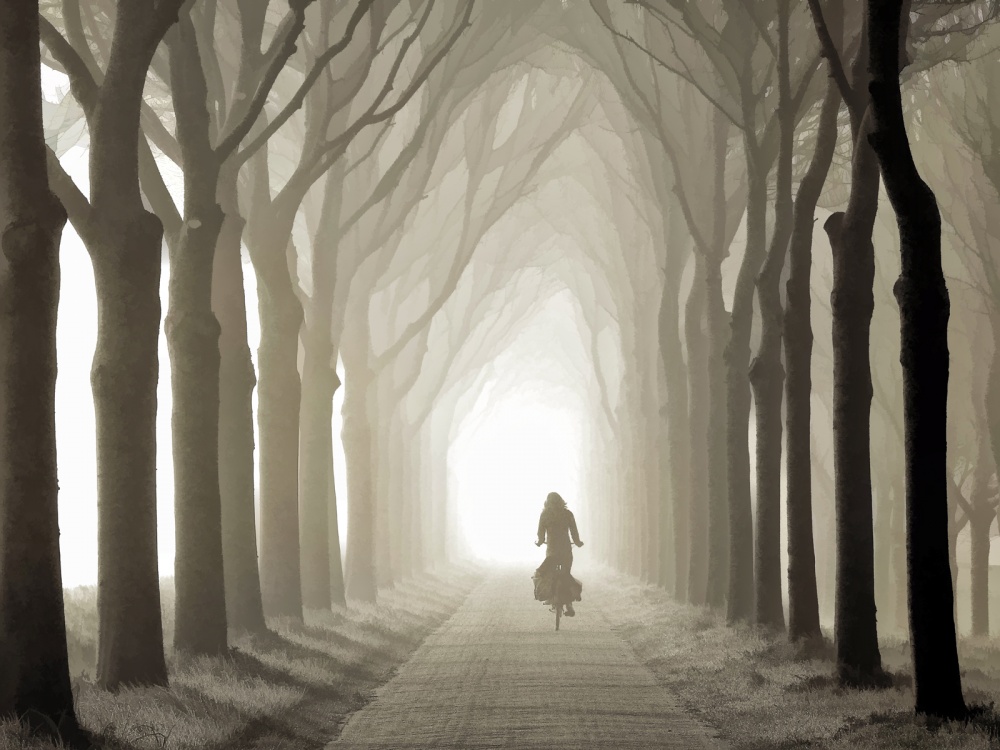
'Gone in a Few Sec' by Lars van de Goor

'Time for You to go' by Fabien BRAVIN
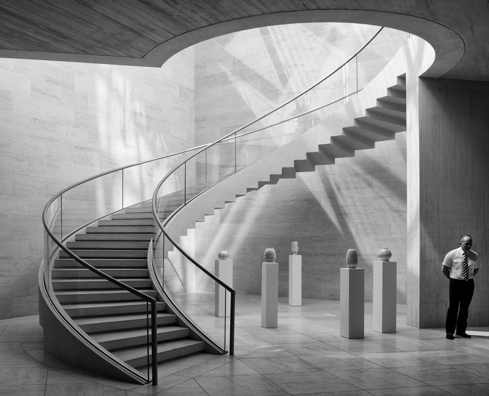
'Guarding the jars' by Jeroen van de Wiel
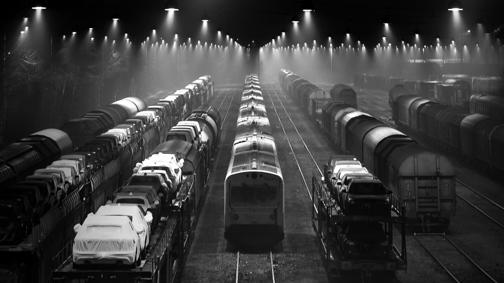
'Trainsets' by Leif Løndal
Principle of Symmetry and Order
Symmetry in a composition creates a sense of solidarity, order and balance, and we tend to seek out areas of symmetrical shapes.
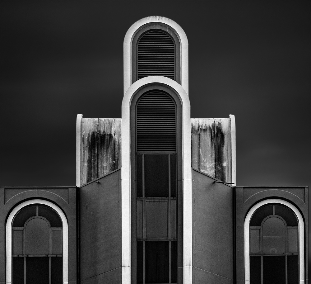
'Rhythm in white' by Jef Van den Houte
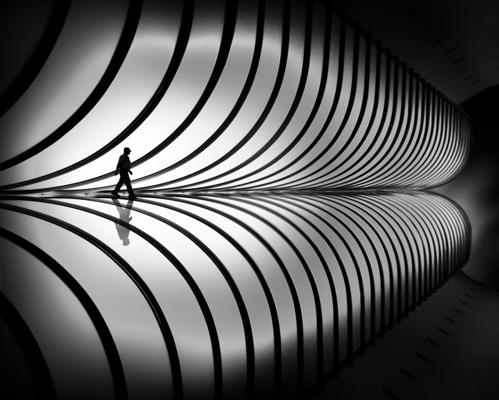
'Tube inspection' by Marc Apers
Principle of Closure
The human eye and brain tend to see things as a whole, filling in missing information and gaps in an attempt to get closure. (We all remember that we are able to make sense of sentences that are written without vowels).
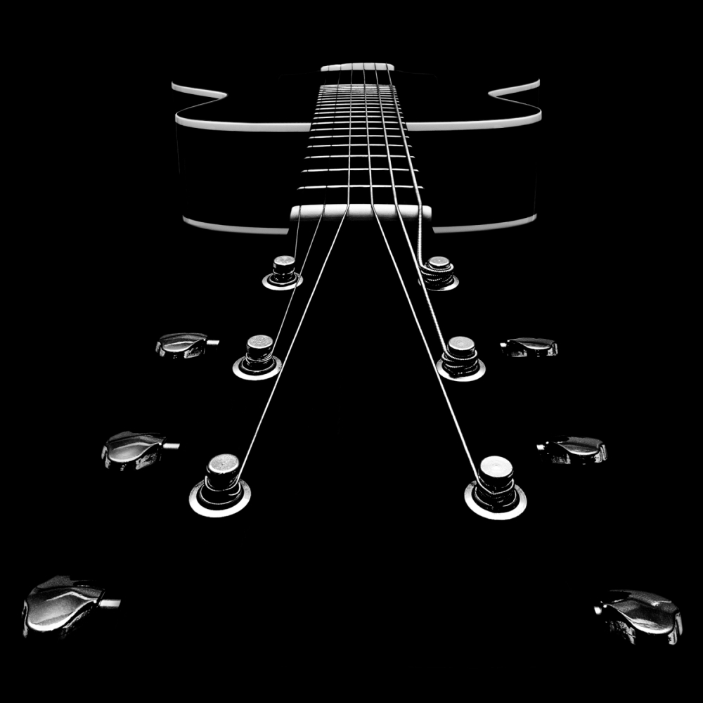
'My New Baby' by Kim Lennert Simonsen

'Private Room' by Sebastian Kisworo
Principle of Proximity
Elements that are placed close together in a composition are seen as belonging together, creating a sense of warmth.
Principle of Common Fate
Elements that move, or appear to move, or even appear to be looking in the same direction, are perceived as related to each other. If there are two people looking in one direction and one in a different direction, the single person will be perceived as an outsider.
Principle of Uniform Connectedness
Elements of a composition that are visually connected in some way (by lines or curves) are seen to be more related to each other than to other elements. They also appear to be part of a group if they appear to be enclosed within a closed region, such as a circle or open arms.
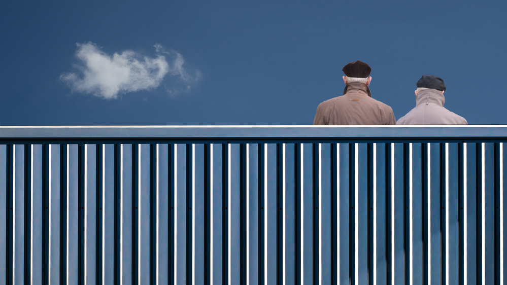
'The fence' by Luc Vangindertael
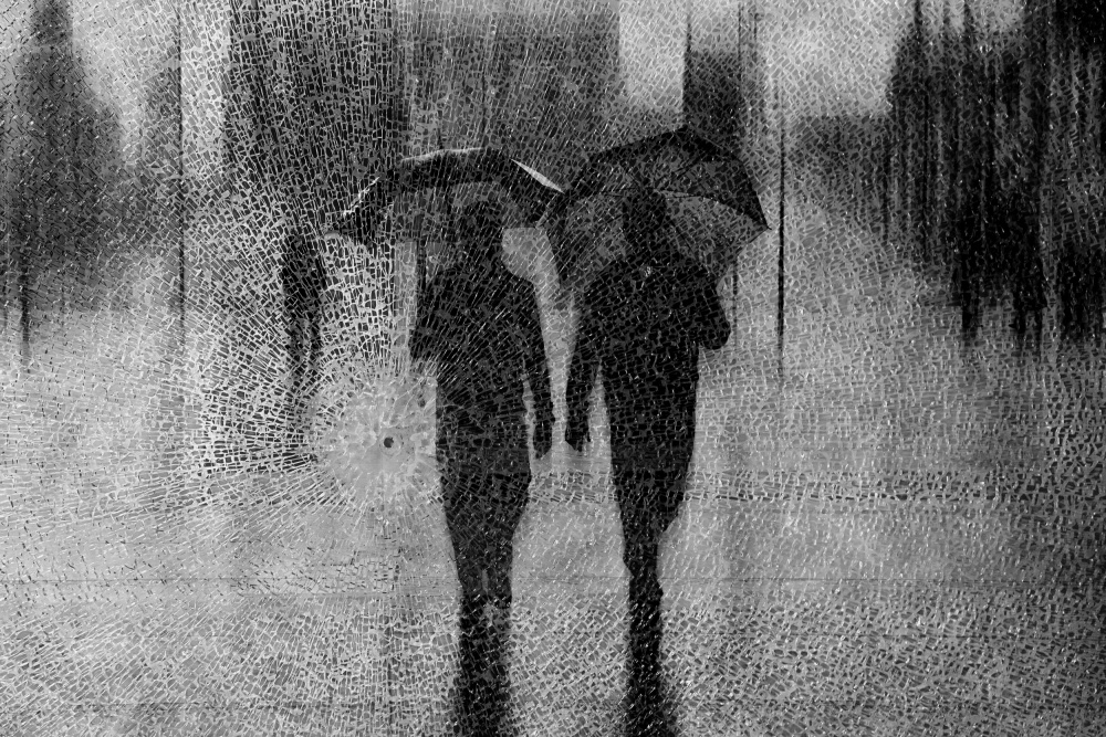
'may the odds be ever in your favor' by Roswitha Schleicher-Schwarz

'Haciendo Planes' by Javier Senosiain
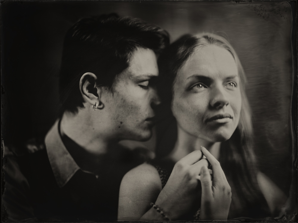
'A&J, Wet plate collodion 18x24 cm' by Dzmitry Az
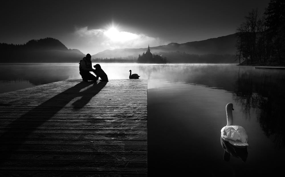
'A peaceful morning at the lake' by Sandi Bertoncelj
Principle of Multi-stability (or Figure/Ground)
The human eye tries to isolate figures from their backgrounds. If subjects are allowed to stand out from their backgrounds through silhouetting, using empty spaces or simple backgrounds, then they are clearly seen.
If, as in some illusions (like the familiar vase/face illusion) the figure and the background both depict a complimentary shape, the brain moves in an unstable fashion from seeing one or the other to interpret the shapes – it cannot see both at the same time.

'watch her disappear' by ambra
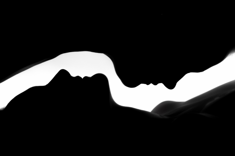
'The Profiles of two Women' by Jan Lykke
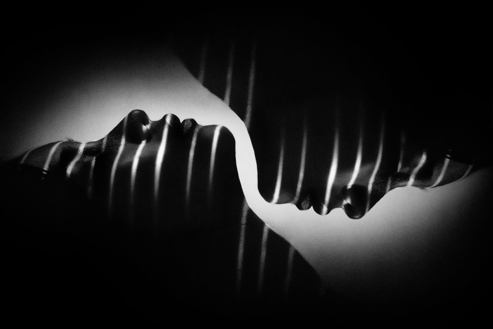
'Gendhist' by Teguh Yudhi Winarno
Conclusion
Gestalt Theory, in addition to being a fascinating subject on its own, opens up a whole new way of looking at composition in art and photography, and should help us to use the principles to make interesting compositions.
Lourens Durand
References:
1) 1) R D Zakia and D A Page, Photographic Composition – a Visual Guide, Focal Press, 2011
2) What is Gestalt Psychology www.verywellmind.com
3) Design Principles: Visual Perception and the Principles of Gestalt, Smashing Newsletter, March 29, 2014
4) Gestalt Theory of Visual Perception. www.users.totalise.co.uk
5) A Ivanova, How to Use Gestalt Theory Principles for Photography. www.experphotography.com/gestalt-theory=photography
6) B Haina, The Gestalt Principles of Design: the Most Important Lesson for All Design, Design Communication Studies, SUNY, Plattsburgh
 | Write |
 | Ludmila Shumilova PRO Very interesting article and illustrated with well chosen images - great photos! |
 | Jeroen van de Wiel PRO Wonderful article, very interesting. And thank you! |
 | Hengki Lee Great article! Thank you for featuring one of my works Yvette! |
 | Luc Vangindertael (laGrange) CREW Great article ! A lot of research to illustrate these principles .... Congratulations to the author :-) |
 | Filiberto Galli PRO This is an awesome article. Fantastic! |
 | Serge Melesan |
 | Bez Dan Very interesting article Yvette, many thanks for sharing it. |
 | Yvette Depaepe CREW Thanks for your appreciation, Dan... All honour goes to Editor Lourens Durand and to the authors of the selected images. I just published it ;-) |
 | Vicente Dolz A very interesting article.
Thanks |
 | Orkidea W. Really great and very interesting study with excellent selection of photos ..Congratulations to all!! |
 | Thierry Dufour PRO Superb article Lourens, thank you for using one of my photos. Congrats for this work !!! |
 | Yvette Depaepe CREW Thanks for this fine and most interesting article, Lourens! Clever choice of images to document it. Congratulations to the authors! Best regards, Yvette |
 | Lourens Durand CREW Thank you, Yvette, and to everyone for your kind comments. |
 | Eduardo Blanco García PRO Thank you.
A very interesting article |