SEARCH


|
|
|
|


Published by Yvette Depaepe in collaboration with Mike Kreiten, Head of the Senior Critics.
1x has a unique feature the founders are very proud of: the photo critique .
Members can submit pictures to a team of knowledgeable senior critics. Their feedback and different suggestions are useful, interesting and enriching even for the best of us.
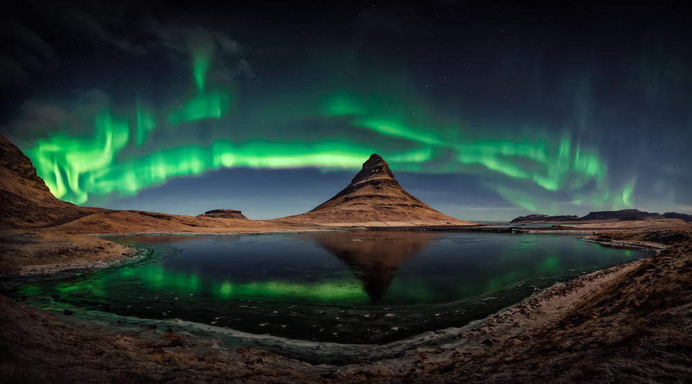
Critique on 'Magic' by José Ignacio Gil Blanco

Sony A7RIII . Laowa 12mmf/2.8 . f/2.8 . 12mm . 5sec . ISO3200
This image was the explosion of that night. It is a panoramic of three horizontal images (the aurora danced with some speed) taken with a Sony A7RIII and Laowa 12 mm. f2,8 - 5,00 sec - ISO 3200. It had been in the typical location but I tried to vary the point of view when the aurora was at its maximum splendour. There was not much time so I went down to the shore and tried to capture the magic ....
The image was not published .. (Obviously I am contaminated by the emotion of the moment) How could I have improved it?
The best ... a night I will never forget
_____________________________________________________________________________________
Senior Critic Steven T
What a fantastic photograph! Thank you for sharing it with us here in Critique. The aurora were really showing off, strutting their stuff for you, and in such a pristine location too. It doesn't get much better than this.
Thank you for providing the exposure data. It's useful as we analyse the image, but more importantly, it's a vital part of the lesson for those who come to Critique to learn techniques. The northern lights, as you wrote, do 'dance with some speed', but the 5 second/ISO 3200 exposures have rendered them beautifully.
You asked what could be improved. All I will suggest is that you consider darkening the foreground - everything below the horizon - so that the scene looks more realistic as a night shot. The aurora is the star of the show here, and the foreground could be a lot darker to minimize any distraction it might be to viewers. Perhaps the left side of the frame could be a bit darker too, to centre attention on the mountain. Is it Kirkjufell in Iceland?
An excellent image, and a powerful memory for you. Having been out in the wilderness on some magical nights myself, I know the feelings of humility, awe, and wonder - and I know how difficult it is to express that amazement in a two-dimensional photograph.
I enjoyed seeing this. Thanks again. I'm hoping and expecting some or our landscape experts on the Critique team to offer their opinions and suggestions here.
Steven, senior critic
José Ignacio Gil Blanco
Hello Steven, thank you very much for your indications. I will try a new process following your advice. It really does not seem like a night and I think it's because we add 90% moonlight (we didn't any type of flash light..) However it is a night shot with focus on the aurora at Kirkjufell (Iceland). Thanks again for your time and directions.
_____________________________________________________________________________________
Senior Critic Javier Roldan
Hola José Ignacio, first of all thank you for posting the shooting settings and gear used. They allow for a better critique and for others to learn. I'm not a landscape photographer but I think still can give you some advice.
First of all, this is an impressive image in general, very beautiful. You can consider yourself lucky for having been able to be in such place at that moment. I've never seen the Aurora Borealis, although I'd like to shoot it one day.
I've just criticized another image that was also very nice but had the added complication of stitching a few shots together. In these occasions, if your camera has enough resolution I wouldn't risk it because it adds extra complexity. Better to try to capture the scene in a single shot and focus on getting it perfect.
In general what I can see here is the photo, although it's really nice, it's also a bit rough:
- It seems there is clipping in certain aurora's highlights (centre and left). You could try to control them with software.
- The foreground doesn't seem completely in focus. You could overcome this in the future with focus bracketing, taking different shots for the background and foreground.
- The main issue though is the viewer doesn't have the sense (and get the magic) of the night. It looks like the background landscape's photo has been taken during the day. I would like to see an image that leaves no doubt it's been taken at night.
- Vignetting on top and the colour gradient is too strong, in the sky.
I hope my comments help and thank you for sharing.
José Ignacio Gil Blanco
Hola Javier, thank you for your time and directions (you have an impressive gallery). I do not understand well the "clipping" of the aurora by the centre and right ... It loses intensity due to its nature (I do not know if it refers to what I need to do). As for the focus on the foreground: I see it right on my computer (keep in mind that when you pass an anti-noise it "softens", besides that the 12 mm at f2,8 is "softening” too.. I completely agree with the two last observations and although the image was taken with almost full moon, I will follow your instructions to try a new processing. Thank you very much for your indications that are very helpful.
_____________________________________________________________________________________
Senior Critic Michael Castellano
A glorious shot, and one you should be very proud of to have in your portfolio.
I'm wondering if a different crop might enhance the image even more? There are two least attractive areas the way I experience the shot.
The first is the bottom area.
Somehow to me I'd prefer cropping out the shoreline as much as possible eliminating the bottom centre area.
The second area that breaks up the effect a little is the brightness of the blues toward the centre. I would try to reduce that brightness a bit. Same for the earthen land areas. Not sure how dark it actually was, but some of the land areas look like it's still daylight. You may also want to crop a bit from the top to balance any crops on the bottom.
This is just my two cents, it's still a fabulous photo.
José Ignacio Gil Blanco
Hello Michael, thank you very much for your time and directions. Your 'cropping' proposal is original. I will try it out without any doubt. We had almost full moon and due to it I understand that the light is very powerful in general, especially on land and near the horizon... I will try to correct this too. Your indications are of great help.
_____________________________________________________________________________________
Senior Critic Martin Zalba
Hello Jose Ignacio, it's good to see a picture of you from Iceland over here. As Javier says, you are lucky to be able to shoot this. The landscape is impressive and the photo very beautiful.
I agree with Javier that the part of the earth has less nocturnal atmosphere than expected in a nocturnal photo. There is a certain incongruity between the light of earth and the light of heaven. For this reason, I would try to darken the area of ​land that, being so illuminated, does not have much night time atmosphere.
Regarding the sky, it is true that the upper part is quite dark, I would try to have a softer gradient and the part that touches the edge of the photo would not be so dark.
I get the feeling that you passed anti-noise to the sky and it has lost some definition and stars have been lost. There stars to see in the raw file. There is a feature in photoshop to select them so that you process them independently from the rest.
I do not know if you passed anti-noise to the earth zone, in which the textures are somewhat blurred. As the photo is very well light, I would not pass anti-noise to the ground area.
For my taste, there may be too much colour contrast and the photo loses some naturalness. Well, these are the aspects that I think should be considered in the processing. I do not know if they will be of any help.
Anyway, big congratulations again for this magnificent shot!
_____________________________________________________________________________________
Critique is also open to all members, and we learn together here. If you see an image you'd like to comment on, your words would be welcome.
 | Write |
 | David williams PRO I am not part of the critique staff, but I can say the only thing that bothers my eye is the darkness on the top left edge at the peak of the “mountain” otherwise it is an amazing shot. Others are saying to have it darker.... I’m not 100% on board with that but definitely a touch of vignetting :) |