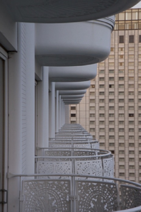
What has turned out to be my most successful photograph is a grab shot, quickly captured when the early stages of sunset temporarily bathed a previously unremarkable set of balconies in peach and purple light. I picked up my camera, cranked down the aperture and managed to snap a couple photos just as the sun started to fade. Some of my favorite images took several hours of work in Photoshop, but this image only required a short visit to Lightroom.
Canon 50D . Canon 17-55mm f/2.8 . 55mm . 1/20s . f/18 . ISO800
This scene suddenly appeared at 6:50 p.m. in late June during a business trip to Tokyo. I did have a tripod, but instead of taking the time to attach my tripod bracket, unpack the tripod and carefully set up a composition, I hurriedly walked out onto my balcony and quickly lined up a handheld shot. My preparation consisted of having my camera close by and being familiar enough with its operation to take the shot I wanted before it disappeared. An aperture of f/18 was arguably smaller than necessary, but I wanted every balcony in focus. Compromising between noise and shutter speed, I set the ISO to 800, resulting in a relatively slow shutter speed of 1/20 second. I left the image stabilizer turned on, and I can normally shoot handheld at relatively low speeds, especially when I brace myself against something solid, which I did in this case.
"I manually set the focus point on the side of the balcony two doors down, based on the theory that at such a small aperture, that was close enough to the hyperfocal point."
Shooting at eye level to keep the camera vertically aligned, I maintained vertical symmetry between the upper and lower balconies. Zoomed all the way in to 55 mm (88 mm equivalent), the use of a short telephoto focal length helped to compress the perspective, minimizing the size of the nearest balconies and maximizing the relative size of the distant ones. I manually set the focus point on the side of the balcony two doors down, based on the theory that at such a small aperture, that was close enough to the hyperfocal point. I tried one more composition, leaning out over the balconies, but it was not as interesting as this shot through the balconies. Then the light changed, and the shoot was over.
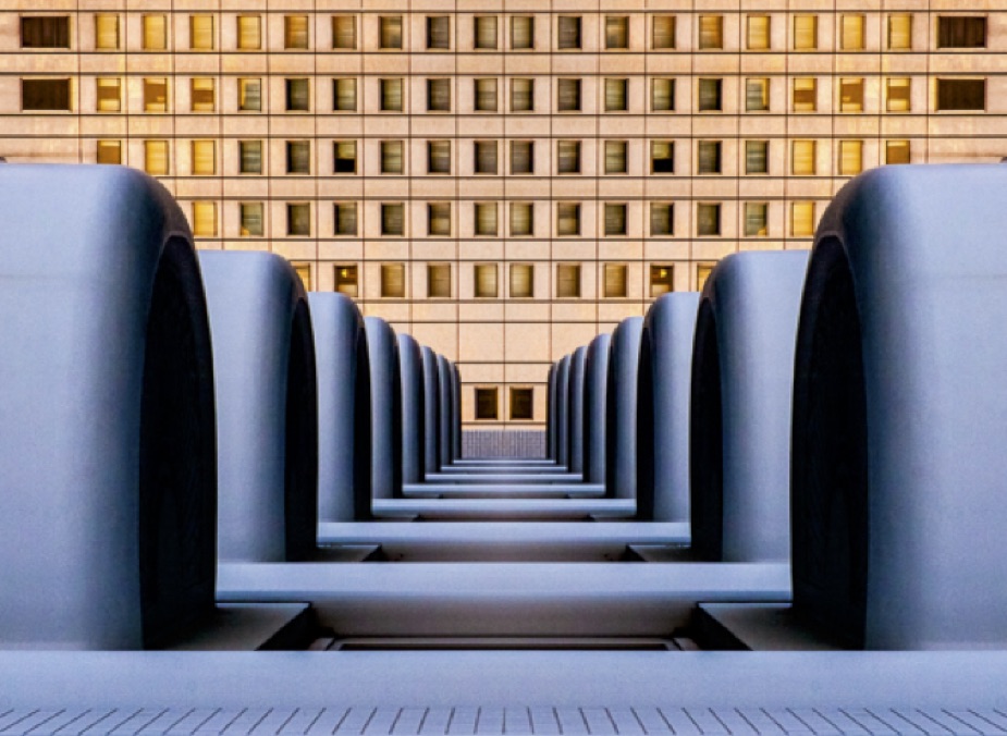
The RAW file did not look especially appealing in Lightroom, but it only took a small amount of work to make a remarkable change in appearance.

Original image

Mirrored version
1) Animals, people and natural light usually don't stand still, so if something compelling appears in front of you, always grab a quick shot first, before reaching for a tripod. If you are lucky, whatever it is that you are capturing will stay in place, and you will have the luxury of time to slow down, use the tripod and experiment with different exposure settings, compositions, focal lengths and lenses.
2) Between shoots I leave my camera on P (Program), Auto ISO, Image Stabilization and Autofocus, and I always leave it turned on. A quick tap of the shutter button and my DSLR is immediately ready to capture something unexpected without my having to stop and fiddle with the settings.
3) Unless the composition is radically tilted, architectural shots require careful attention to framing. Hold the camera level and ensure that the sensor is parallel to the subject. If the result is not fully parallel to the frame, or if it exhibits some keystoning (i.e., the building looks like it is falling backward), refine the framing in the digital darkroom with cropping and perspective correction.
I've been shooting since I was nine years old with my formative darkroom years taking place in the context of a nationally ranked American high school yearbook. Although I worked for a newspaper for a short time while at university, photography is my avocation, not my career.
I've been the Photographer of the Year at several camera clubs in the USA and UK, and I have my LRPS distinction from the Royal Photographic Society. "Tokyo Balconies" is one of several of my images that have appeared in Amateur Photographer magazine's APOY competition.
Currently living in the USA and working full-time in the IT industry, I take photos because I have visual ideas but cannot draw or sculpt to save my life. I take photos because I discovered that it is a medium I can master to a degree that pleases other people. I take photos to tell stories about people, things, places and events, some of which are on my blog.


