SEARCH


|
|
|
|


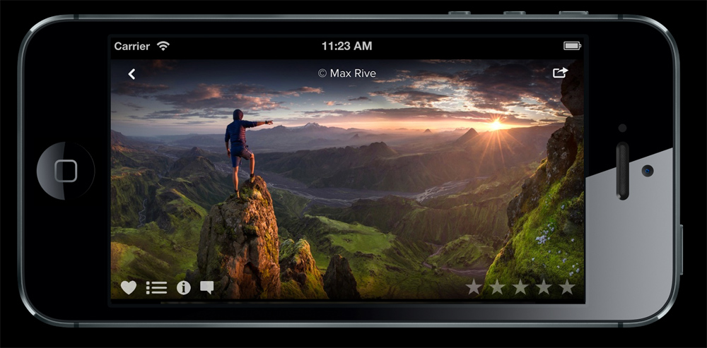
We have now released our new mobile site with a completly new way to browse 1x by scrolling, swiping and tapping with your fingers. It's very easy and a lot of fun to use. You have to experience it to see what we are talking about so pick up your smart phone or tablet and browse to 1x.com!
Help us to find the best photos in the world by clicking the "Curate"-button in the mobile site and vote on photos. The more you vote the higher you will rise in levels which means that your votes will carry a much greater weight.
If you go to 1x.com and add it to your home screen it will be very much like a native mobile app.

Enjoy photos in the new 1x mobile site by browsing to 1x.com in your smart phone or tablet.
 | Write |
 | Christopher Budny While my iPhone5 isn't the ideal platform to view beautiful 1x imagery, it was my only mobile option---until this weekend when I bought a new iPad Mini w/ Retina Display.
I've had several problems however, trying to use 1x on this device---while my pc and iPhone5 continue to display 1x normally.
Particularly, when I log into 1x on my iPad, and go to my account/my uploaded gallery, I get all my images in a vertical single column of thumbmails (just like on my iPhone) -- but when I ta a thumbnail, no image appears to fill the screen -- just a black screen.
But, if I go out to the 1x main page (mobile version) and click some other artist's thumbnail, up comes the full screen-filling image. It appears only my own images, in my own 1x gallery, won't display after I tap thumbnail... Just wanted to bring to your attention.
-Chris |
 | Alvaro Márquez Arango It's nice, but it'd be better if it was an app. |
 | Jacob Jovelou FOUNDER Missing photos on profiles should be back. |
 | Deleted User Yes, they are! Thank you sir. Please give some thought to the branding concerns about the look of the mobile site. In good marketing practice it should "look" as close as possible to the main site. |
 | DietmarB PRO Hello. I agree with Clyde. The lighter grey background on the mobile page is not so nice like the darker background on the main page. Thanks anyway for the mobile page! |
 | Jacob Jovelou FOUNDER The image quality on tablets will be improved tomorrow. Working on a fix at the moment! |
 | Deleted User Susanne is right about incomplete galleries. In my profile, not all curated photo and not all "All Photos" show in the galleries of the mobile site. |
 | Susanne Stoop It is nice to have site on mobiles. There are however a few buts. On my Ipad(1) the photos look unsharp. It is as if they are enlarged more than 100%. They look good on my phone. My guess is that the photo's are minimized for phones, but also used for ipads and thus automatically enlarged for that device. It makes curating photos properly rather difficult.
I am also missing the forums and the weekly themes |
 | Susanne Stoop PS. Not all the photo that are published on the front page, are shown on the fp of the mobile devices. |
 | Francesco Santini it's nice but i have some advice:
1 the quality of the photo is not good (iphone 4s)
2 sometimes there are problems in loading and scrolling photos
3 It's possible to vote the same photo twice (on pc and tablet/smartphone) |
 | Robot boy zxz Some feedback:1.should a few simple instructions;2.on my iPad the photo do not appear in Retina resolution with Safari (even in full screen).3.picture browsing speed is very slow |
 | Deleted User Am I missing something? Or are Groups/Forums not there. And I have the same experience as Ran on Android, photos don't size differently when rotating the tablet. The white surround on everything on homepage seems like a disconnect to main site. The "look" on the main site should follow to the mobile app as much as possible imo. It's a branding thing.
|
 | Andreas Wonisch It looks nice, especially the "Curate" view. However, on my iPad 3 the photo do not appear in Retina resolution with Safari (even in full screen). |
 | Darren Kelland Fantastic news and just what I have been waiting for. Works beautifully on iPhone. |
 | Ran Dembo PRO Very nice, and a big step forward.
However, it dosnt look as it is adapted to the screen size (landscape photos do not appear fully, no matter how I hold the phone) and browsing in the site is not fluent.
I have a WP8 phone. |
 | Simun Ascic PRO I have also WP and same problem with landscape format. Obviously other plaforms don't have that problem. |
 | JAE Very fluid and easy to use. |
 | Edoardo Gobattoni Great, Great,Great ;) |
 | Ralf Stelander FOUNDER Glad you like it! |